Hisense
Founded 1969 in Qingdao, China. for 5 decades Hisense has been committed to developing innovative consumer electronics products. Today, Hisense is the No.1* TV brand in China and South Africa.
Hisense mission is to improve consumers lives and add value to partners by developing high-quality, innovative and affordable products while also committing to exceed expectations and deliver results in the United States.
Hisense aspires to be the most reliable company and adored brand in the U.S. Consumer Electronic and Home Appliance sectors, providing sought-after solutions that fulfill customers' desires.
As the #2 TV brand in the North America market, Hisense is beloved by its users, but the previous brand lacked energy and prominence. It was time for the world to immediately understand its distinction.
ROLE
Brand Strategy
Art Direction
Visual Identity
Verbal Identity
Web Design
The Approach
Hisense will serve as the exclusive partner of “X-Factor Moments,” a weekly content series on the NBA’s social media channels featuring big plays and standout moments throughout the 2023 NBA postseason. As the Official TV and Home Appliance
Partner of the NBA, Hisense USA will also make NBA League Pass, the league’s premium live game subscription service available on the NBA App, accessible on Hisense TVs in North America beginning with the 2023-24 season.
Breakdown
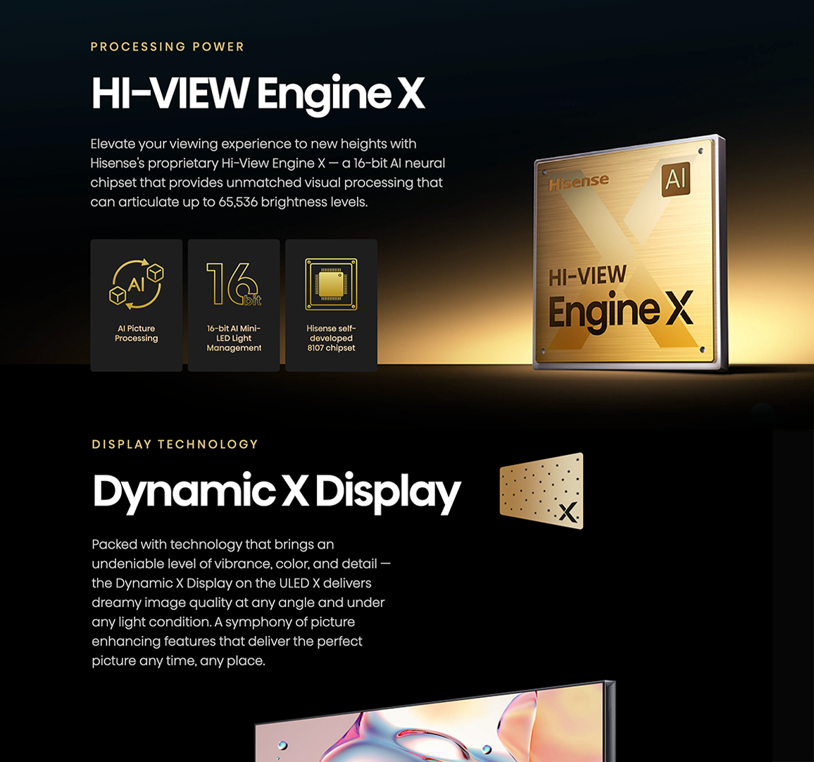
The campaign began by providing assistance with script writing for the NBA Playoff ads featuring Celtic's Jayson Tatum and Paul Pierce, alongside the legendary Mike Breen. Creative efforts were also devoted to social and product branding. As part of the NBA partnership, Hisense introduced its new ULED X product landing page. I took charge of rearchitecting some site content to incorporate updates to the product and proposed new mental models to better
understand its features and offerings. High-fidelity wireframes, or HiFis, were then employed to address the challenge of visually conveying the information effectively. Through UI design, I brought the product detail page to life and ensured that ULED X was positioned as the benchmark for future PDP page developments. This was achieved by employing stylized visuals and a well-crafted visual hierarchy to enhance the overall user experience.
READ THE NEXT CASE STUDY


