UCLA Health
UCLA Health is a company founded by members of the progressive healthcare community, tackling the complex health tech landscape through sincerity, humanity, and a results-driven approach.
UCLA Health is among the most comprehensive and advanced health care systems in the world. Their mission is to provide state-of-the-art patient care, generate research discoveries leading to new treatments and diagnoses, and train future generations of health
care professionals. Together, the UCLA Hospital System and the David Geffen School of Medicine at UCLA strive every day to be a leader in setting the standards of excellence.
UCLA Health needed a career website establishing themselves as leaders in the health tech space, while staying true to their purpose-driven values.
ROLE
Brand Strategy
Art Direction
Visual Identity
Verbal Identity
Web Design
The Approach
UCLA Health asks, “What does the world look like when we invest in improving our employment website from the inside out?” They're dedicated to helping not only patients, but also the medical professionals navigating the frustrating inefficiencies of recruitment opportunities.
UCLA Health is cutting-edge, but still very human.
I knew we needed to create a brand for UCLA Health that embodied their brand attributes of emotional, modern, and sincere.
Breakdown
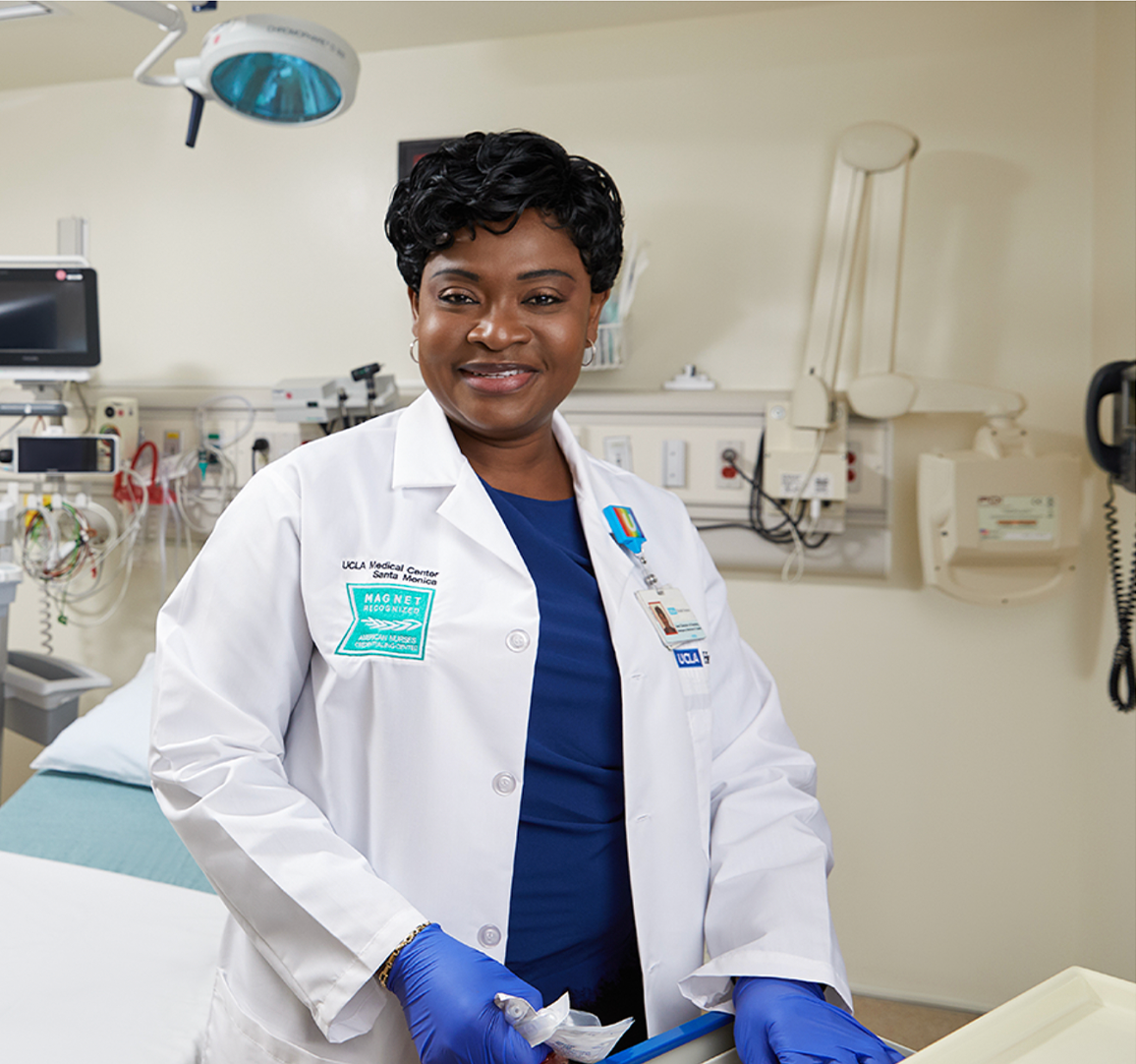
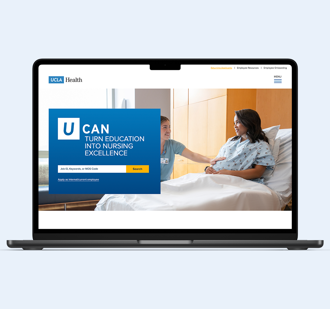
As part of the UCLA Health brand, two distinct photography styles were defined - portrait and environmental. The primary headshot style aimed to complement the core color palette, exuding warmth and inviting authenticity with neutral backgrounds and genuine expressions, while also serving as a contrast to other photography styles and the overall visual language system. The U CAN logotype was crafted using an adapted version of the Proxima Nova typeface, striking a balance between boldness and
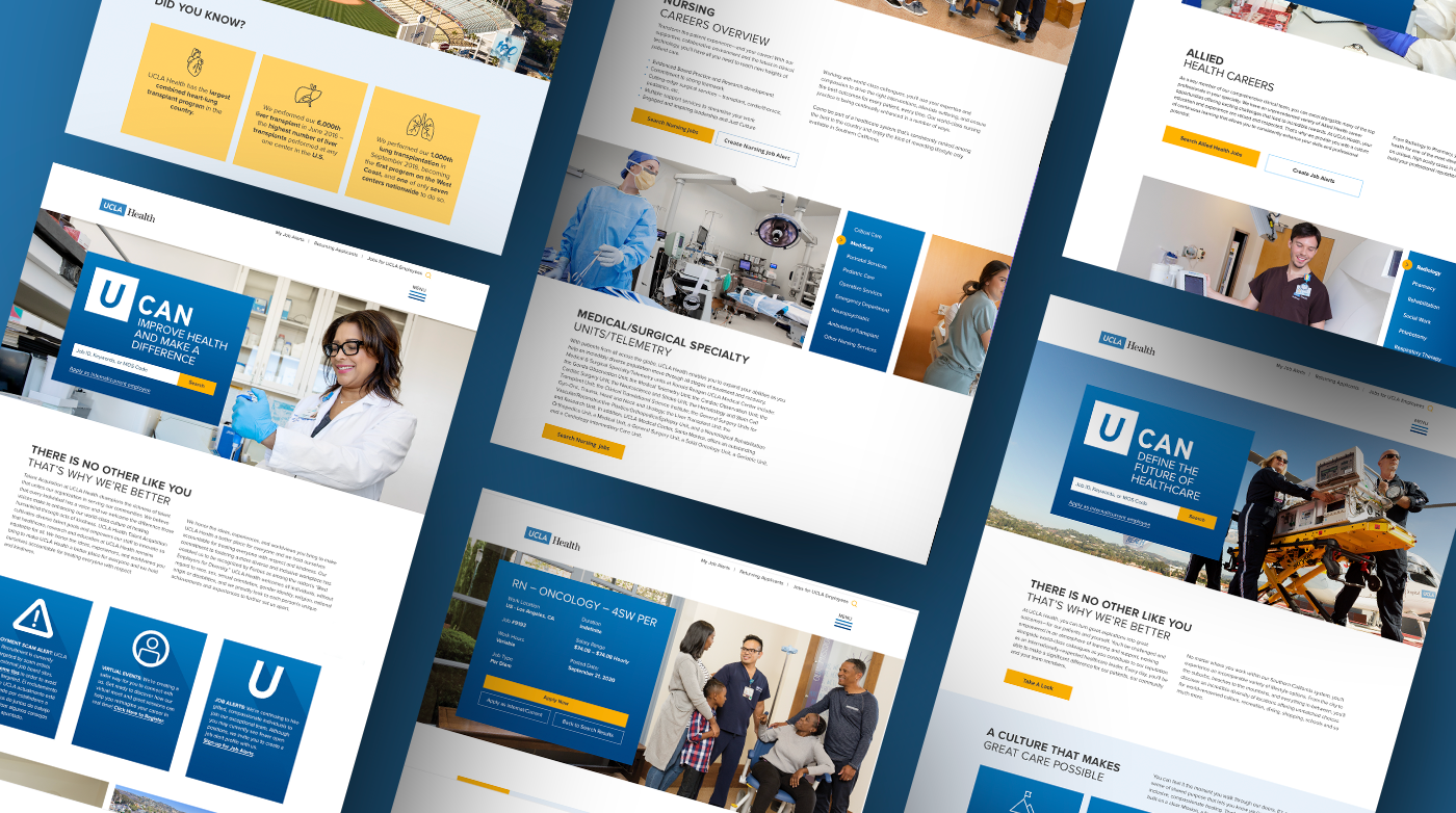
softness, reflecting the human touch integral to UCLA Health's mission. The subtle angle from the mark was carried through the logotype, reminiscent of the original UCLA Health mark. During the rebrand launch, the identity was extended to 30 pages of the employment web experience, where the typeface Proxima Nova was allowed to shine, creating delightful design moments while consistently promoting the U CAN concept throughout the site.
READ THE NEXT CASE STUDY


